Hercules Harness
Rebrand | Marketing Collateral
Project & Company Details
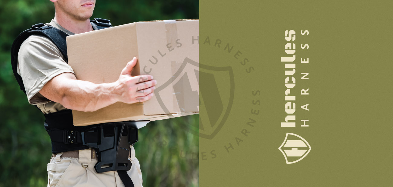
The Hercules Harness, a wearable, lightweight harness, was conceived to assist in manually moving objects while promoting proper carrying techniques. It is designed to reduce muscle strain and fatigue to the neck, shoulders, arms and back. The Hercules Harness brand is focused on providing a convenient and simple safety solution for those who regularly carry heavy or awkwardly shaped items.
The Ask
The brand wanted to target a more specific audience, military and government channels, and reached out for a logo and brand redesign.
In response to the brand’s objective of targeting military and government channels, the logo and brand redesign focused on aligning with its core brand message while appealing to this new audience.
The Approach
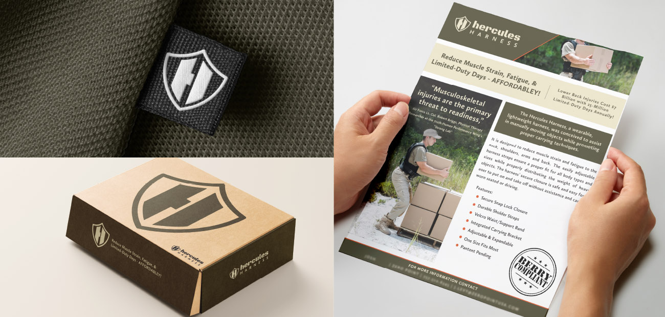
In reimagining the logo mark, my goal was to depart from a literal depiction of the brand name. By merging a shield symbolizing safety with the initial ‘H,’ the aim was to create a visually compelling mark that represents both security and strength. Simplifying the design not only improved scalability but also conveyed a clearer message about the brand’s values.
The logotype uses a bold block-lettered stencil-styled font to give a sense of industrial or military aesthetic.
The color palette combines dark greens, browns, tans, and vibrant orange. These colors align with the brand’s practical yet safety-focused goals and resonate well with its target audience.


